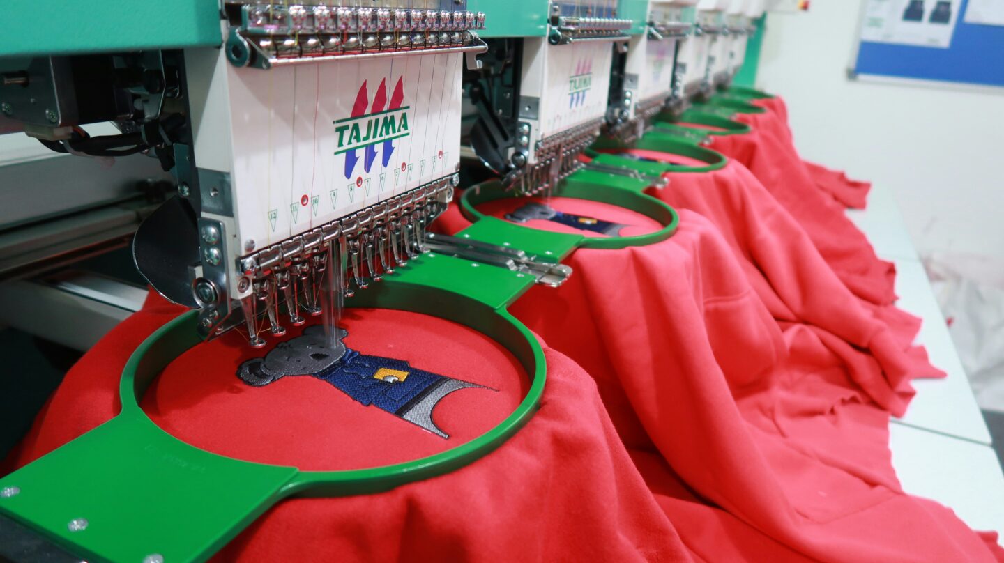
A company logo can look sharp on a computer screen and still turn into a disappointing mess once it is stitched onto clothing. That is why professional embroidery digitizing services play such an important role when preparing logos for workwear. An embroidery machine cannot simply read a JPG, PNG or PDF and understand how the design should be stitched. The artwork needs to be converted into an embroidery file containing instructions for stitch type, density, direction, underlay, sequencing and other important settings.
When those instructions are wrong, problems quickly become visible. Lettering can close up, outlines can shift, fabric can pucker and small details can disappear. These issues are especially noticeable on uniforms, polo shirts, jackets and other branded workwear where the logo represents the business every day.
Below are some of the most common embroidery file mistakes that can ruin otherwise good workwear logos.
1. Using an Image File Instead of a Proper Embroidery File
One of the first mistakes is assuming that an ordinary image file can be loaded directly into an embroidery machine.
Formats such as JPG, PNG, PDF, AI and SVG describe how artwork looks visually. They do not tell an embroidery machine how to physically stitch the design.
An embroidery file contains information such as:
- stitch locations
- stitch direction
- thread changes
- jump stitches
- trims
- stitch density
- stitching sequence
Machine formats can include DST, PES, EXP, JEF and others depending on the embroidery machine being used.
Simply changing the extension from PNG to DST will not create a usable embroidery design. The logo has to be properly digitised so that every part of the artwork is translated into suitable stitches.
Automatic conversion software can sometimes produce a basic result, but it often creates unnecessary stitches, poor paths and incorrect densities.
2. Making Lettering Too Small
Small text is one of the biggest causes of poor workwear embroidery.
A font that looks perfectly readable on a screen may become unclear once reproduced using thread. Embroidery has physical limitations because each letter is built from stitches rather than pixels or ink.
When letters are too small, several problems can occur:
- spaces between letters disappear
- small gaps close up
- letters merge together
- thin strokes become uneven
- words become difficult to read
This is particularly important for workwear logos containing telephone numbers, website addresses, employee names or small taglines.
The embroidery size should therefore be considered before digitising begins. Sometimes small text needs to be enlarged, simplified or changed to a more embroidery-friendly font.
The purpose is not to change the company identity unnecessarily. It is to make sure the branding remains readable when stitched onto fabric.
3. Keeping Too Much Fine Detail
Logos designed for websites, business cards or printed materials often contain very fine elements.
These might include tiny lines, shadows, gradients, detailed icons, narrow borders or small decorative shapes.
Thread cannot reproduce every tiny detail that appears in digital artwork.
Trying to force too much detail into a small embroidery area can result in a cluttered design where individual elements become difficult to distinguish.
For example, a detailed company crest that looks excellent at 1000 pixels wide may need some simplification when embroidered at 80 mm across the chest of a polo shirt.
A good embroidery file focuses on maintaining the important visual characteristics of the logo, including:
- overall shape
- brand colours
- readable lettering
- recognisable symbols
- clear spacing
Removing unnecessary detail can often improve the finished embroidered logo rather than reducing its quality.
4. Incorrect Stitch Density
Stitch density refers to how closely stitches are positioned together.
Getting this wrong can affect both the appearance of the embroidery and the garment itself.
Density that is too high
When stitches are packed too tightly together, the embroidered area can become thick and stiff.
Excessive density may also cause:
- thread breaks
- needle breaks
- puckering
- fabric distortion
- longer production times
A dense logo on a lightweight polo shirt, for example, can pull heavily on the material and create visible wrinkles around the design.
Density that is too low
The opposite problem occurs when there are not enough stitches.
Low density can allow the garment fabric to show through the embroidery. Colours may look weak, fills may appear incomplete and the overall logo can look cheap.
Correct stitch density depends on the design, thread, stitch type and garment material.
5. Using the Wrong Underlay
Underlay stitches sit underneath the visible embroidery and provide a foundation for the main design.
Although customers usually never see them, they have a major effect on stitch quality.
Underlay helps stabilise the fabric, support top stitches and prevent the embroidery from sinking into textured materials.
Too little underlay may cause the logo to lose its shape or allow stitches to disappear into the garment.
Too much underlay can make the design unnecessarily thick.
Different workwear materials also behave differently. A pique polo shirt, fleece jacket, softshell garment and cotton apron may require different underlay settings.
The embroidery file should therefore be prepared with the intended fabric in mind.
6. Ignoring Push and Pull Compensation
Fabric moves during embroidery.
As the machine creates stitches, thread tension can pull fabric inward while stitching pressure can push areas outward.
This movement is known as push and pull distortion.
Without proper compensation, shapes may not look the way they appeared in the original artwork.
For example:
- circles may become slightly oval
- satin columns may become narrower
- borders may move away from filled areas
- lettering may appear thinner than expected
Push and pull compensation adjusts the digitised design to account for this movement before the embroidery begins.
This is one reason embroidery digitising involves much more than simply tracing a logo.
7. Poor Stitch Direction
Stitch direction has both a technical and visual purpose.
Changing the direction of stitches can help separate different parts of a logo and create a cleaner appearance. It also affects how light reflects from the embroidery.
If every section uses the same stitch angle, the design may look flat.
Poor stitch direction can also increase fabric movement and affect registration between different sections.
Digitisers commonly use different stitch types depending on the artwork.
Satin stitches are often suitable for lettering, borders and narrow shapes, while fill stitches are normally used for larger areas.
Choosing the correct stitch direction helps create cleaner edges, better texture and a more polished embroidered finish.
8. Creating Too Many Jumps and Trims
The order in which a logo is stitched matters.
Poor sequencing can make the embroidery machine repeatedly move between different parts of the design.
This creates unnecessary jump stitches, trims and colour changes.
While these issues may not always be obvious from the front of the finished garment, they can affect production efficiency and create a messy back.
For a single garment, a few unnecessary movements may not seem significant. Across 200 or 500 embroidered uniforms, however, those extra trims and jumps can add considerable production time.
Efficient embroidery digitising creates a logical stitch path that reduces unnecessary machine movement while maintaining the appearance of the logo.
9. Using the Same Embroidery File on Every Fabric
Another common mistake is assuming one embroidery file will work perfectly on every garment.
It might not.
A file created for a cotton polo shirt may behave differently when stitched onto fleece, a softshell jacket or a thick workwear garment.
Different materials stretch, compress and react to stitches in different ways.
For example, embroidery on fleece may require stronger underlay because stitches can sink into the fabric. Stretchy garments may require additional stabilisation and careful compensation.
Depending on the material, changes may be needed to:
- stitch density
- underlay
- pull compensation
- stitch length
- sequencing
For businesses ordering embroidered polo shirts, hoodies, jackets, uniforms and other workwear, it can sometimes be better to prepare different file versions for different garment types.
10. Skipping the Test Sew-Out
A logo can look correct in embroidery software and still produce unexpected results on the machine.
That is why a test sew-out is valuable before beginning a large production run.
A physical sample can reveal problems that are difficult to identify from a digital preview.
These may include:
- small text closing up
- border misalignment
- thread tension issues
- fabric puckering
- poor colour separation
- incorrect stitch density
Once the test has been inspected, the embroidery file can be adjusted before the full workwear order is produced.
For corporate uniforms or large quantities of branded clothing, identifying a problem before production can prevent wasted garments, thread and time.
How to Avoid Embroidery File Problems on Workwear
Most embroidery problems can be avoided with good artwork preparation and careful digitising.
Start by supplying the clearest version of the company logo available. Vector artwork is useful because it provides clean shapes and accurate lines, although high-resolution artwork can also be digitised.
The final embroidery size should also be confirmed before the file is prepared. A design for a small left-chest logo may need different settings from the same logo used as a large jacket-back embroidery.
It is equally important to tell the digitiser which garment or fabric will be used.
A properly prepared embroidery file should consider the relationship between the logo, stitches and fabric. The logo defines what needs to be reproduced, the digitising determines how the stitches are created, and the fabric affects how those stitches behave.
Before bulk production, a sew-out or sample can also help confirm that the embroidery is readable, balanced and suitable for the garment.
Final Thoughts
Many problems blamed on embroidery machines actually begin with the embroidery file.
Poor density, tiny lettering, incorrect underlay, bad stitch sequencing and unsuitable compensation can quickly turn a professional company logo into disappointing workwear branding.
Good embroidery digitising considers much more than the appearance of the original artwork. The file needs to account for the logo size, fabric type, stitch direction, thread behaviour and production method.
When these elements are prepared correctly, embroidered workwear can deliver clean lettering, defined shapes and consistent branding across polo shirts, jackets, hoodies, uniforms and other garments.



Leave a Reply